The National Bass Association of the Deaf — NBAD — is a tournament organization built by and for Deaf anglers. They came in wanting a logo that could compete visually with the bigger sport fishing brands their members see on the water every weekend, while still feeling like it belonged to the Deaf community
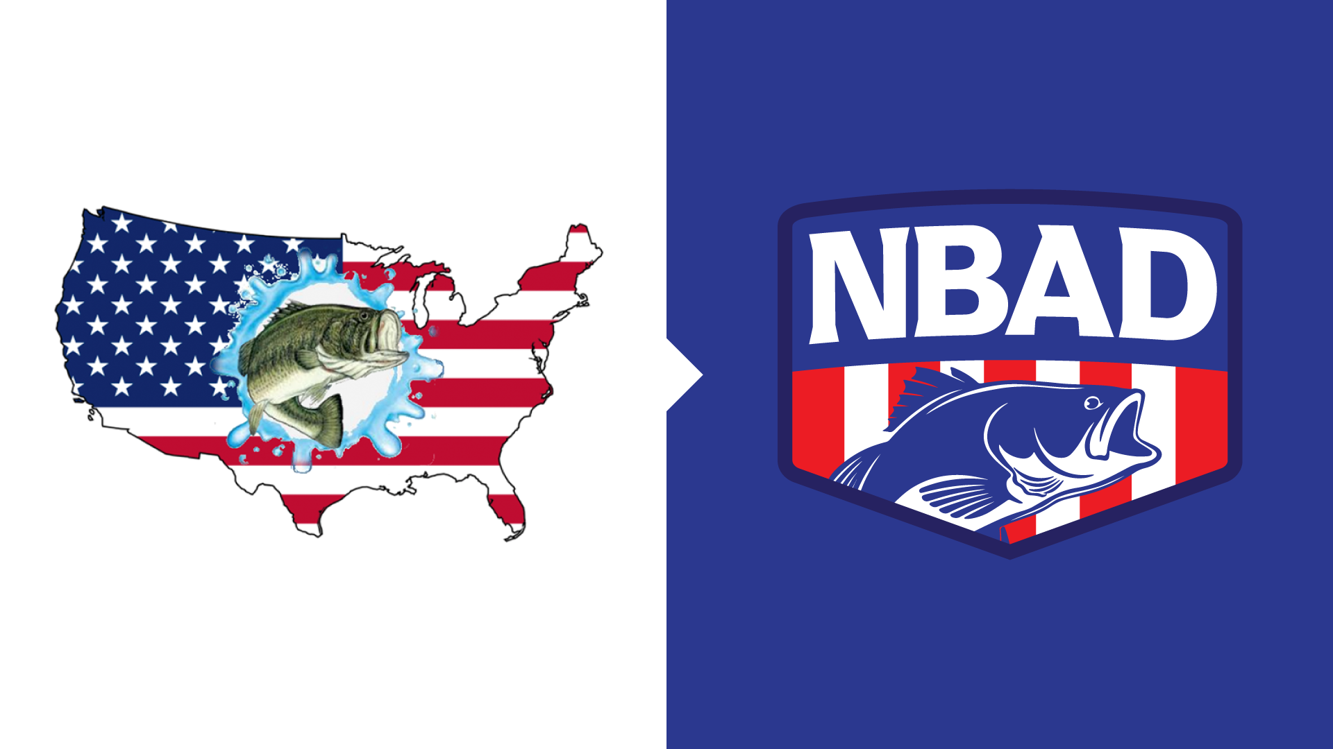
The original mark was busy and didn't scale well. My redesign pulled the form down to its essentials: a confident bass silhouette, clean type, and a balanced lockup that reads from twenty feet away on a tournament banner or two inches across as a hat embroidery.
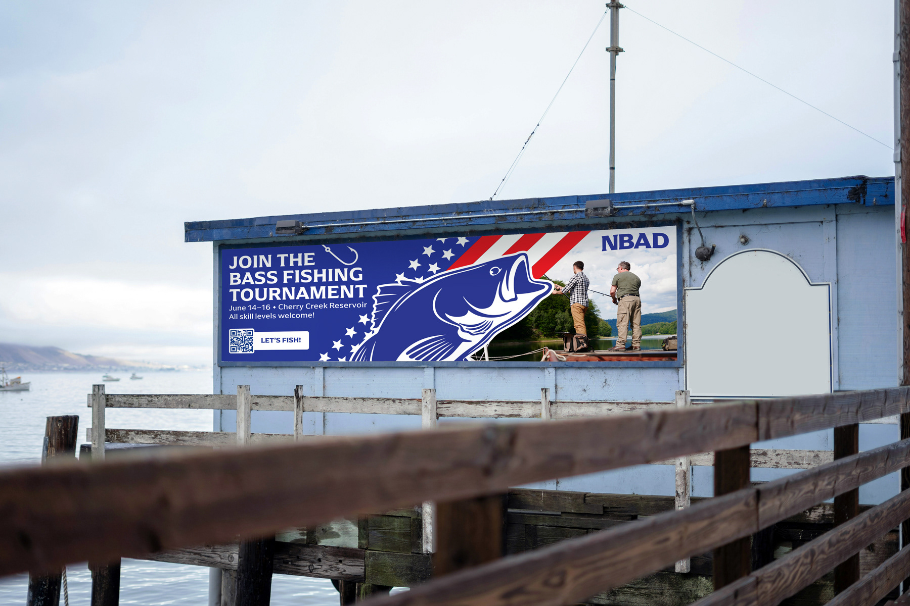
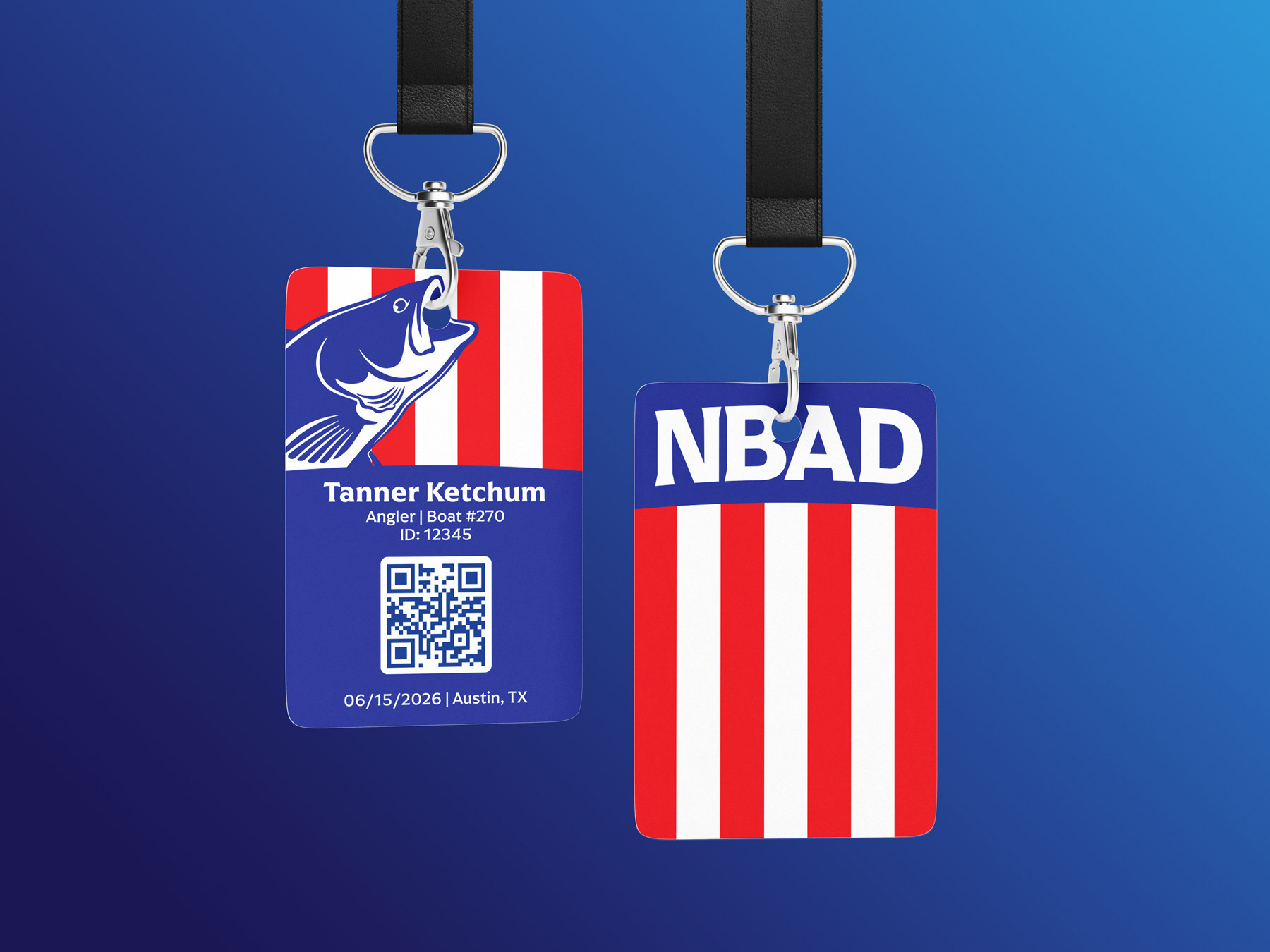
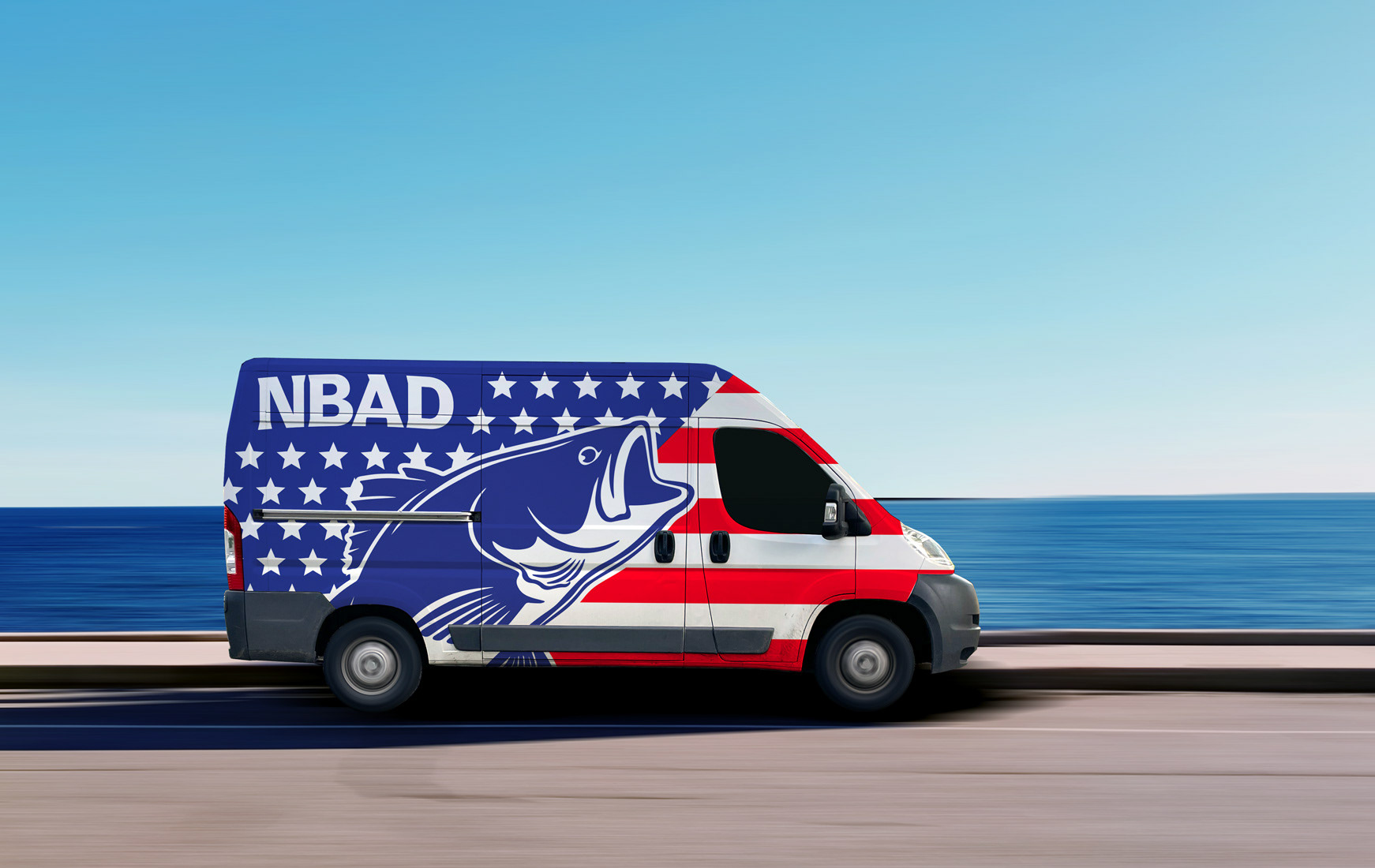
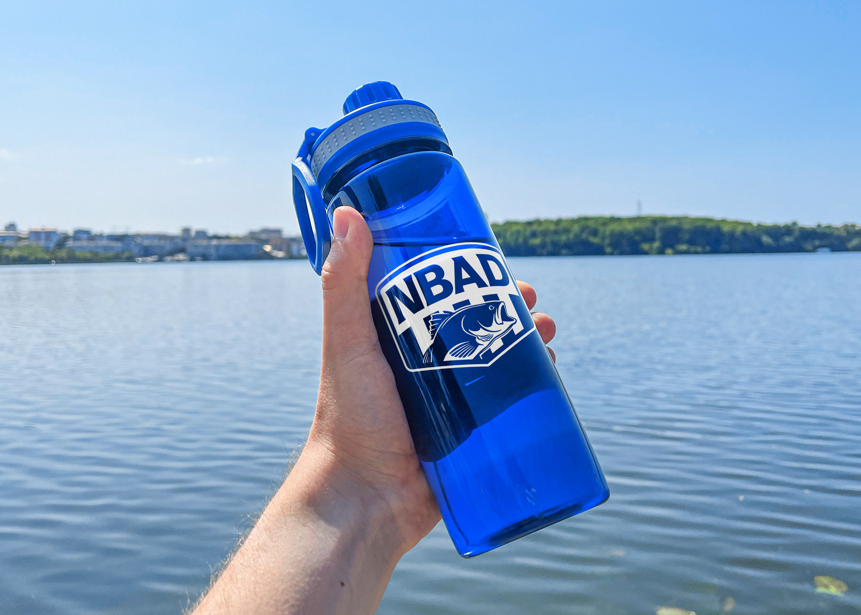
Like all my work for Deaf-owned and Deaf-serving brands, the design had to communicate without relying on language alone. Strong shapes, high contrast, and a clear visual hierarchy do the heavy lifting — so the mark works for everyone, whether you're hearing the announcement at weigh-in or watching it across the dock.