Lifestyle & Access is a therapy practice built on a simple but powerful idea: that trauma doesn't have to define you; it can shape you. The challenge was translating that emotional journey into a visual identity that felt honest without being heavy. The brand needed to signal warmth and forward motion, not clinical distance, and to do so, the moment someone landed on the page.
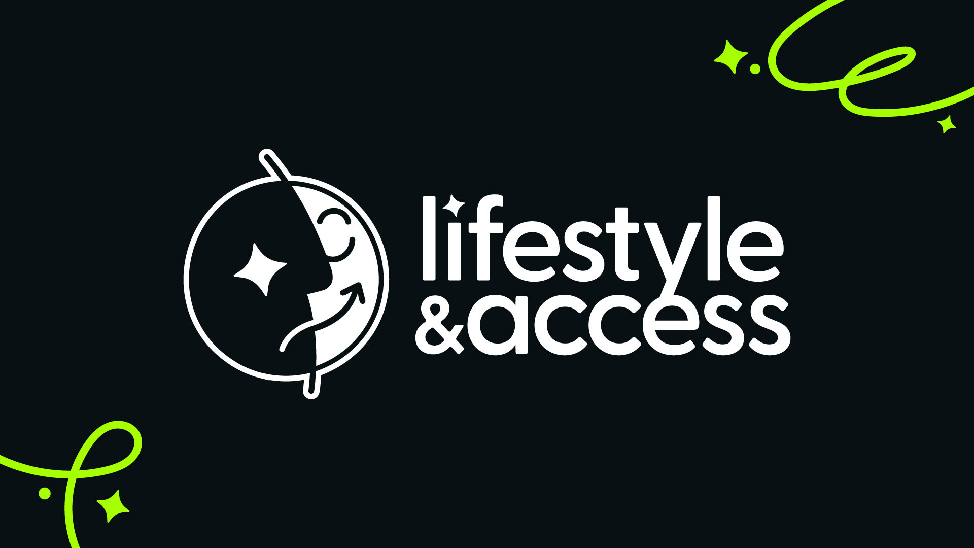
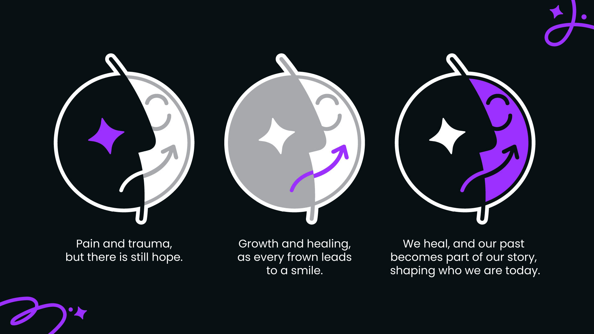
The color system became the foundation of that story. I built a palette that moves from deeper, grounded tones toward lighter, open hues, a visual metaphor for the shift from a difficult past toward clarity and possibility. Typography followed the same logic: approachable but structured, with enough softness to feel safe and enough confidence to feel trustworthy. Every decision was in service of someone who might be visiting the site in a vulnerable moment.
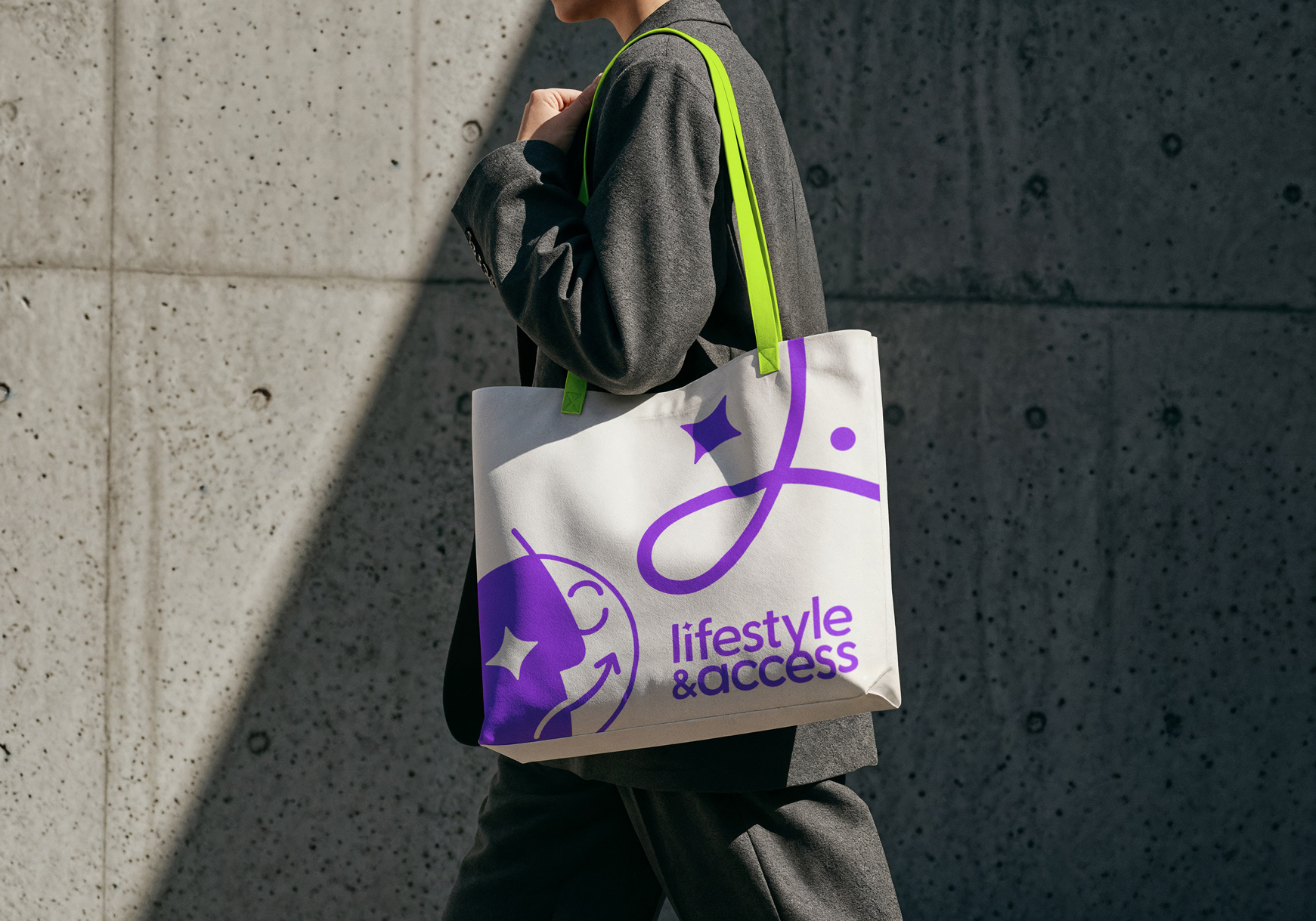
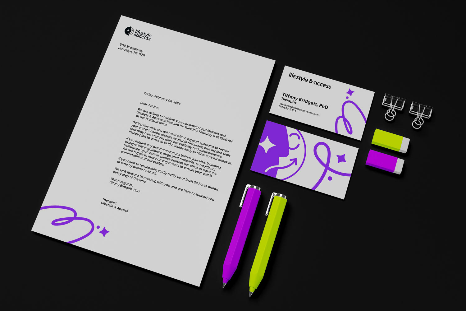
Accessibility wasn't a checklist; it was central to the work. Lifestyle & Access serves people with disabilities, so the identity had to hold up under real-world conditions: sufficient contrast ratios, type that scales cleanly, and a visual hierarchy that works for screen readers and low-vision users alike. The result is a brand that meets people where they are, regardless of how they experience it.