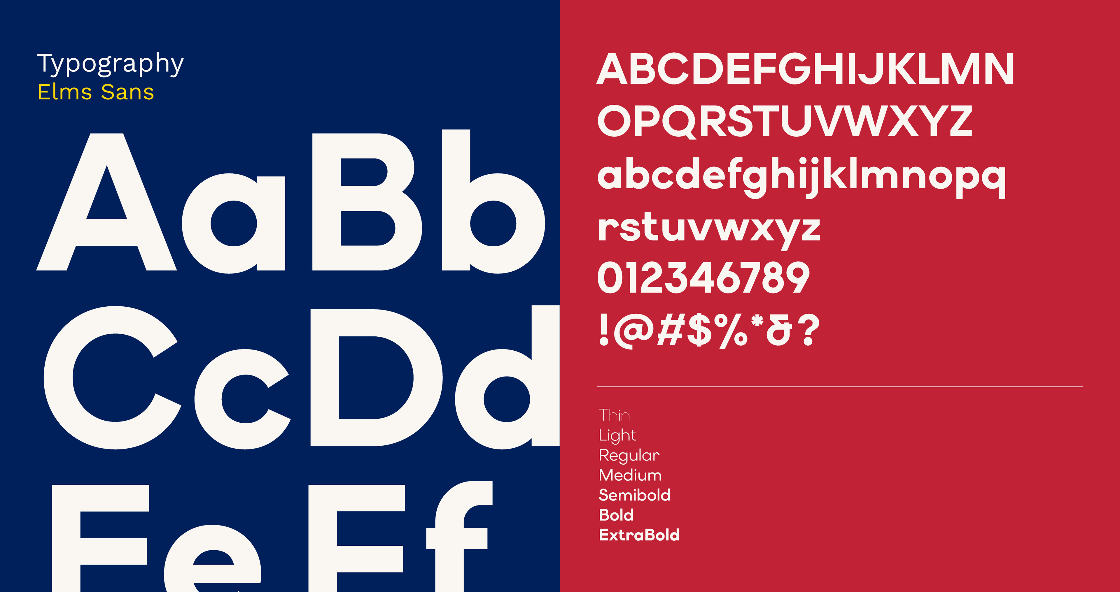
Sense Colorado, formally the Colorado Division for the Deaf, Hard of Hearing, and DeafBlind (CDDHHDB), serves three distinct communities across the state through programs spanning communication access, assistive technology, and advocacy. The rebrand had a clear mandate: retire the complex CDDHHDB acronym and replace it with an identity that felt welcoming, unified, and immediately legible to the people it serves.

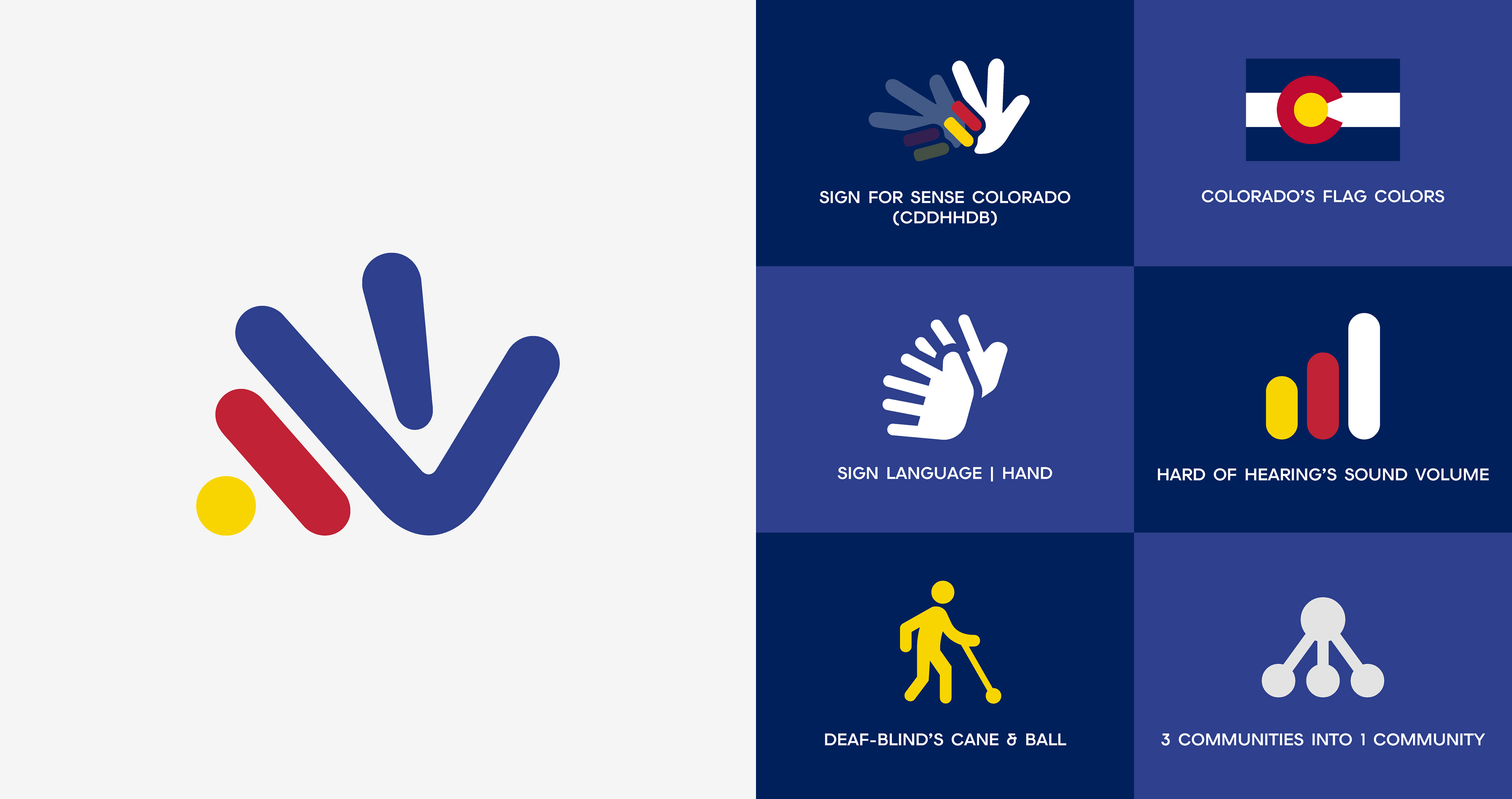
The logo brief wasn't required to represent all three communities, but the solution went further anyway. The mark draws from the ASL sign for CDDHHDB, abstracts a signing hand in motion, and layers in the Hard of Hearing's sound volume bars and the Deaf-Blind's cane with the ball, all held together by Colorado's flag colors. Three communities, one form, and a palette that roots the identity in the state it serves.
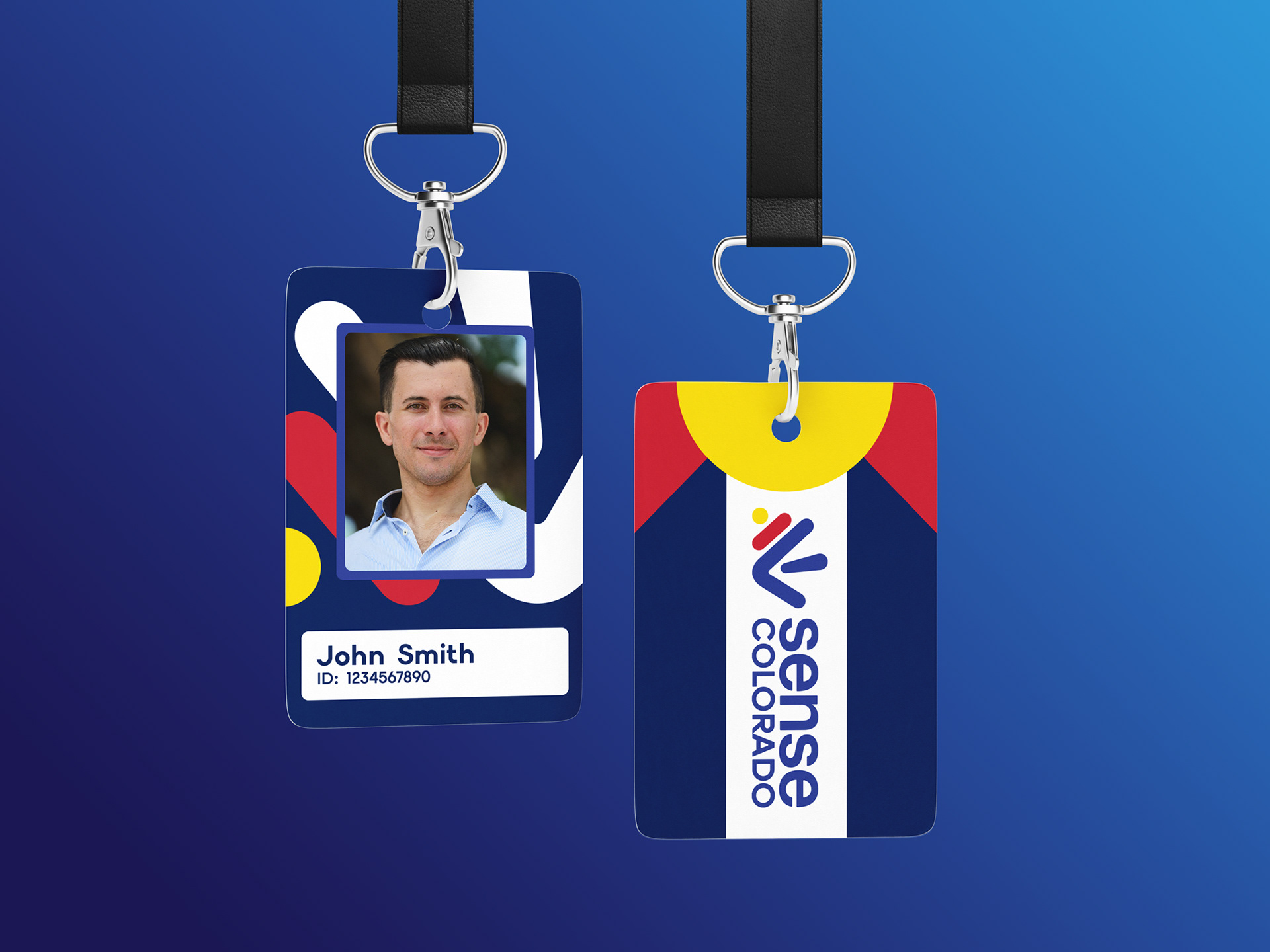
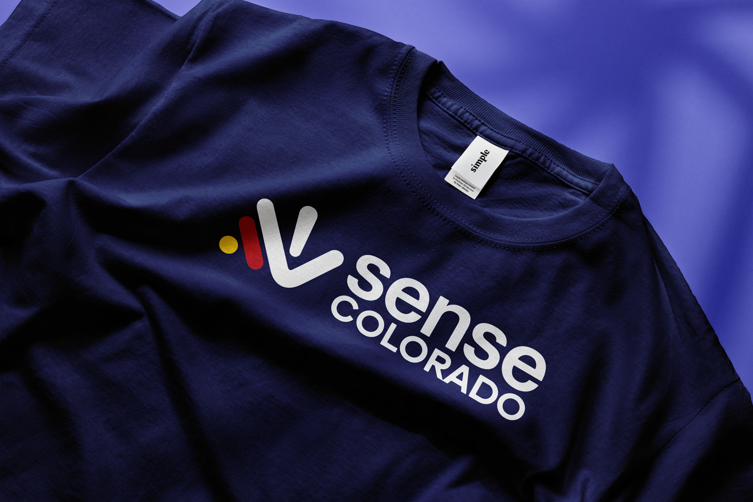
The result is a mark that earns its complexity without showing it. At a glance it reads as a clean, confident symbol. Look closer and every element has a reason to be there. For an organization that needed to feel approachable to families, professionals, and policymakers alike, the identity does what the old acronym couldn't, it communicates who Sense Colorado is before anyone reads a single word.